
 Oh man, how many times have you been in this situation?
There is a madman with a gun trying to kill you, and he keeps yelling "you're not carnival personnel" because, why trying to flee from the madman, you ran past a sign that clearly states "Carnival Personnel Only".
Damn, I hate when that happens.
 What's with that sign? Don't they know that there is a madman after me? Perhaps running by that sign makes me a jerk, but I'll be damned if I'm going to stand around waiting for a madman to kill me. If only there was some way to alleviate the guilt associated with clearly violating the "carnival personnel only" rule.
A Ha I have the solution.....
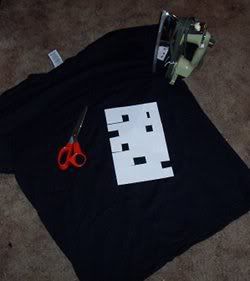 For starters, I'm going to need a black t-shirt, some iron-on letters, an iron, and some sweet left-handed scissors. Some of the letters are missing because, for a toddler's birthday, I made a special birthday present tank-top that says "bullshit" on it.
Let's get crackin, shall we?
start by cutting out the letters needed for the shirt.
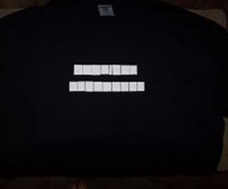 Carefully align the letters on the t-shirt. Since the letter on the paper are mirror images of what will show up on the shirt, special care is needed to make sure that the letters get placed right. This looks pretty good, so plug in the iron and move along to the next step.
( actually, this isn't that good, I'll explain later)
 Make sure that the iron is dry. We don't want any steam to mess up our letters. With the iron set to "wool", press on the iron-ons for about 15 seconds. If you press too long, or use too high of a heat, you might burn the letters a bit; which is exactly what I did on the "bullshit" tank top.
Flip the tshirt over and iron the other side of the letters for about 5 seconds.
 Hot Diggity! Problem solved.
Now, when the madman starts yelling "you're not carnival personnel", one can simply point to their shirt and say "Well actually, Yes I am".
The alignment issue: When I think of all of the issues that I've encountered while utilizing typography in a graphic, it amazes me that I didn't think about the kerning of the letters. The "V" and "A" in Carnival should be a lot closer together.
The best part: This isn't for me. This t-shirt is a gift for a friend. Hey buddy, when you read this give me a call, I have a gift for you.
Keep making stuff, and rock on.
- Tubular Music Thingy Part 2
- Beaglebone console output and a faster boot
- Tubular Music Thingy (part 1)
- get and speak the weather
- Getreel youtube-dl wrapper
- Two hours with the Archos 43
- HTML5 for a specific platform? I prefer to develop native apps
- a bit of dev talk about MuttonChop media player
- case for my status server
- my tiny todo list and some ruby
- The Camp Mug (almost) Test
- 2012 Tizen Developers Conference in San Francisco
- Freedom Jar is Full
- Web UI speed up using HTML5 Server Sent Events
- LEDs, BeagleBone, and my ToDo List
- a case for the BeagleBone
- fixing the car mirror
- Basic HTTP server in Vala using GIO Sockets
- sewing up a bling thing
- Trip to Austin
- convert hexadecimal string to an integer with Vala
- Training for 2012: Wuggling
- ABC tune grabber/converter
- A trip to Lancaster
- a new media playing machine
- Don't turn Tizen into WebOS
- making some chili sauce
- grumpy kid
- beer network improvement
- Ripping my DVD collection
- ruby script to search files in a directory for a string
- Pacific Pinball Museum Mission
- A Tale of Two Mugs
- shishi odoshi prototype
- file downloader in Node.js that handles redirects
- Travelling Far Part II
- python shell-fm web interface
- not quite a letter to cherrypal
- Audio playing class in Ruby with Gstreamer
- A quick fix
- my resized images using Ruby and Imagemagick
- one pound of coffee
- noise-canceling headphones that actually work
- updating my dynamic IP DNS information with Ruby
- Hello World in Ruby
- Bacon Apple Cider
- clawhammer sudo modprobe
- a web.py introduction
- The Skillet
- banjer strap on the cheap
- The Letter to Dell
- Linux Outlaws episode 170
- Not the 2010 Petaluma Whiskerino
- Monte Rio
- a new power switch
- the coffee cup review
- seriously, that thing is garbage
- keeping a GTK TextView cursor in view
- A tale of three sticker
- minimize/close to system tray in Python GTK
- A markdown editor/viewer in Python
- Red Phone Mumble Test
- Saturday Sassafrass
- A Friday Frolic
- Toshiba laptop review
- Google no longer uses Microsoft
- regarding Heybuddy and python stuff
- I'm calling you!
- heybuddy identi.ca client
- making a change holder thing
- Did I win? Yes and No.
- photograph sticker
- share this on facebook
- the damn computer died
- kilt alteration
- audcast streamer in vala with gstreamer, gtk and webkit
- The Mullet Adventure
- A Letter to the California State Legislature
- will dogfooding the frenzy leave me bitter?
- basic sitemap file maker in Python
- rock and rolling down the street
- Time to Celebrate
- game of life : Vala, SDL
- game of life : python, clutter
- networked timed text-to-speech goodness
- battery status in a screen session
- Bright Bike
- turning gears
- incremental screenshot namer wrapper
- a nice little feature/bug
- drawing circles
- broken VHS fixed
- cloudy phone number finder
- network quitter fixer
- the hot sauce experiment
- non-delivered emails sent to AOL domains
- GIMP mathmap experiment results
- tri-force tuna gift
- leave early, take your time, enjoy the solitude
- N37°49'8 W122°28'48
- rotary phone computer interface in action
- python script to play the latest version of an audio broadcast
- rotary phone computer input device
- server log spam from Microsoft?
- creating a CAPTCHA
- hello HTML 5! a simple audio player
- How does that increase security?
- getting familiar with GWT, a porting experiment.
- You're Not Carnival Personnel!
- "disable" a web app's buttons using javascript and css
- litterbugs and jaywalkers
- a basic web-app with pyjamas
- shell script to aid in compiling Vala projects
- Banjo part 4: she's finished
- Accent Characters in Linux with Xorg
- Terminal emulator part deux!
- Community
- Terminal Emulator in Vala using GTK and VTE
- Where is the MPAA on this one?
- pyclutter stage fullscreen hack
- Banjo part 3
- from necessity comes something
- If you build it, they will spam
- writing blogging software ( using data from blogspot )
- From WBEZ Chicago......
- Simple Switch Input to Enter a Command
- perplexing ponderence, pertaining penguin presents
- baby steps: the evolution my feature-free PHP framework
- ruining a perfectly good lamp?
- thank you bazaar
- quick not-so-little bikey bag
- Vala musings : int to string, packages, and starting with main
- my motor vehicle warranty is about to expire? really?
- Bike Trailer Part 2
- getting dandy with a hair pretty
- a not so elegant fixer up
- use python and gstreamer to get the tags of an audio file
- trials with gstreamer, pygst, and goom visualization
- Gaarrrrrrrrr!
- more pyclutter: get a move on - behaviourpath
- scrollwheel css div Internet Explorer 7 problem fixed
- Hello World using pyclutter - a half assed tutorial
Cheers,
Andrew
Please fix how your pages look in RSS readers like Akregator. Maybe tweak the CSS so classes are used instead of inline CSS, like Blogger does? Or maybe include a "clear" declaration in the inline CSS?